
Currently Viewing:


The Tretiak Collection
no charge
no charge
Daniel Tretiak, after publishing his book The Life and Works of Haku Maki in 2007, found that he had more to say about prints as they came into his life. And so, from time to time, he wrote Research Notes and published them on this site.
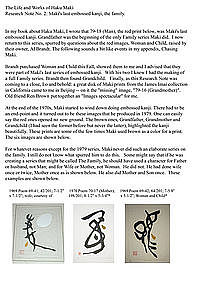
For Note 1, he wrote the following:
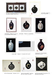
This is a collage of Maki prints depicting the tokkuri (sake bottle). We have added images of most of the prints here. Enjoy. Be Sure to CLICK Above as directed, please.
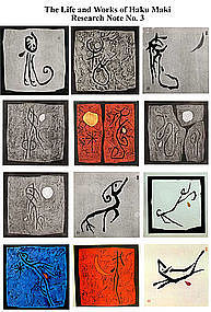
Daniel Tretiak, after publishing his book The Life and Works of Haku Maki in 2007, found that he had more to say about prints as they came into his life. And so he wrote Research Notes and published them on this site.
I call this set of images The Zodiac but Maki formally called this Animal Song + the animal name. The actual prints here are Animal Song - Monkey Dog Snake and Dragon. Each print came in an edition of 50 copies. Red Lantern Gallery in Kyoto distributed them. 1968.
A diptych of Maki prints, one done in 1968 and the other in 1969. In the best of Maki's spartan austere style, they are Poem 68-40 and Poem 69-13.
Haku Maki produced this “pair” of prints in 1968. The first image is Child. This is the first time Maki produced an image with Child as a theme. Poem 68-52. The second one is his kanji for Water. Poem 68-53. This image was used again in the set of 21 prints he produced for Festive Wine, which was issued in 1969. The colors in both are strikingly beautiful in these images – as they also are as prints. Maki signed each in white ink, something he rarely did. Both prints have had hard lives, they were actually folded. Now they have been wonderfully restored.
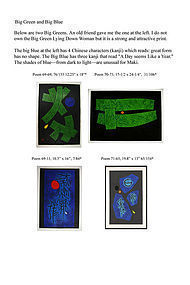
In 1968 Haku Maki produced this large Blue image of Child. The blue is vivid and the yellow face is in sharp contrast. To the far right is a small Green Child, the same theme, different key color. It appeared in 1969. The red image is a trial run for a Festive Wine print. It never made it. The translators of Festive Wine or Anne Brannen nixed it and used a different Child image, the fifth frame. It might appear that the block used to produce all thee was the same; however, the Blue image is considerably larger than that used for the red and green ones. Blue one is Poem 68-53 12.26" x 16.25"
Haku Maki (1924 to 2000) was an important late 20th Century Japanese printmaker. He created images often using kanji (originally: Chinese characters) as the theme for his prints. He created about 2000 different images. Many are known. Here I present a number of images which I had never seen until this year even as I have gathered many. I still lack the image for Autumn in this series: any assistance in finding it would be most appreciated
winter was formerly in the John and Joyce Meyer Collection in Seattle.
The last image is of a 1972 Maki rendering of all four seasons.
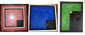
These are 3 different “takes” of the kanji for Stone.
Red is Work 74-58 (Stone) ; Green is 76-56 (Stone);
Blue is 76-54 (Stone).
The green one is larger than the other two. All have the striking black sun as one stroke of the kanji.

In The Life and Works of Haku Maki I refer fairly briefly to his Big Reds and other large prints of the late 1960s and early 1970s. In this Research Note I present a more thorough compendium of this type of image and commentary. If any readers know of an image which should be in this Note, please let me know. For now please enjoy these.
Poem 70-63 (Me) was acquired in 2010.
Poem 71-90 ed of 108
Dance 69-2
NOTE: This is the first part of a two-part note. The second part is Note 7 B.
(continued) the last two panels show the same kanji for Rising in two different designs. Maki seemed to have liked this theme. Big Red is Poem 71-50; it was preceded by Poem 70-48 a smaller print. These are shown below.
The image on the left was done in 1970 the other in 1971. The image at the left looks like 2 or 3 quick brush strokes. It is very delicate. It can mean clothing.
The image at the right is heavy, many brush strokes, a complicated kanji. It can mean depression. It is Poem 71-14.
Haku Maki was undoubtedly Japan’s most prolific print maker of the second half of the 20th century. Many of his works were serious works of kanji and also ceramics. These three are perhaps a bit frivolous. They are actually pretty: each one has seeming globs of color The blue one on the left has kanji in the blue stone; the central one has a wonderful black kanji for Mountain in the center; and the one on the right four globs, each of a different color. And one splash.
Around 1960 Haku Maki probably did the Ox as a woodblock print. He was then a young artist in Tokyo. He may have done some Ox images before James Michener did his now wellknown book, but probably not many: 510 were used in the book The Modern Japanese Print". The prints of Japanese artists included in the book are large-ish, it is not embossed. The print is in excellent shape--it is still tipped onto the original archival backing that was in the book.
In 1999 toward the end of his life, Maki did the print again; undoubtedly he did a new block and ran it off. This was an edition of just 75. Here I show the old and the new Ox prints; old is at the left.
The appearance of Ox in this book presaged Maki doing 21 prints in Festive Wine by 1969, including an Ox. That one seems almost to have been dancing. 19” x 12”
Haku Maki was a major creative Japanese print maker of the second half of the 20th century. His major output from 1965 to 1990 consisted to several different themes of prints Kanji was the main theme for the first 15 years of that period. Then.
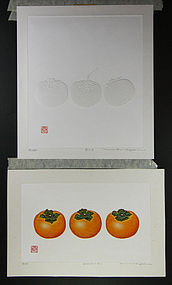
Ceramics was second. But he also did a large number of prints with persimmon on theme. Most of the persimmon prints showed just one fruit. A few showed two Only two showed 3. These are shown here
Both prints are serene no jarring colors or edges.
The one with 3 clearly visible one shows 3 different persimmons side by side The shadow persimmon are quiet hard to see even when held in hand. Both prints are well done, sharp clear images. The typical bottom margin shows the edition number the Maki signature and title of the print
From 1971 to the early 80s he did well over 100 prints with Persimmon as the main theme
The print with the colored persimmons is Kaki
Z-1 The white persimmons print is simply 81-3 manning It was done in 1981
persimmon is sign of autumn i am told
As autumn wanes, and first snows arrive, persimmons are a radiant reminder of beauty in a time of decline and decay, offering hope that the beauty of the fruit will attract birds to disseminate seeds for regrowth in the spring. Hence a sign of joy, beauty and hope for the future......
The last frame is from a private collection in
Asia. I cannot ascertain the title or the year.
Maki used the same blocks for the last two images.
One of Maki’s favorite themes was the image shown here. Some outstanding ones are shown in the listing. I reckon Maki did about 25 different prints with the theme Child. Several little children can be seen swimming in the image in frame 9. The child in the right of this list panel is the image imprinted in the cover of Festive Wine, to which Maki contributed 21 images in 1969.
The Tretiak Collection
not for saler
not for saler
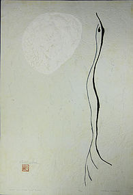
Maki Poem 616 earluy print still with single layer of paper.
The image is of a Bird and Moon. This print has been fully restored